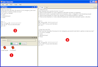
At first, the UI and UX (User Experience) was planned to be relatively the same as the predecessor (link has a screenshot). If you look at the screenshot you will see that all of the content is displayed in one window with tabs. The user can only work on one quiz at a time. If multiple question banks are desired to be used, then the user must open up another question bank which will appears in a separate window. All windows have the same functionality, they are just a different question bank. You can even look at the current quiz in multiple locations which can be confusing at first. Overall, the predecessor is a good program and has done well over the years; however, as you can see, it shows its age.
It was at this point that I realized I could design the application however I wanted, as long as it fit the requirements. Consequently, I became consumed with coming up with a more intuitive UX. I immediately got to brainstorming and before too long I had something. I would have the layout of the entire application would be split up into 3 parts.
- Browser - At startup, all of the question banks the user has will be loaded and be explorable much like folders in windows explorer.
- Question View - If a question was selected in the browser, then the full details of the question would be displayed.
- Quizzes - Multiple quizzes could be open at a time and displayed in tabs.
 I submitted it to the FITS NPCs for some feedback on the new UX and overall received positive feedback. I was glad that they liked it, but I was not exactly enthralled by it myself. It was too bland and was not exactly professional looking. Something was going to have to change...
*saved game*